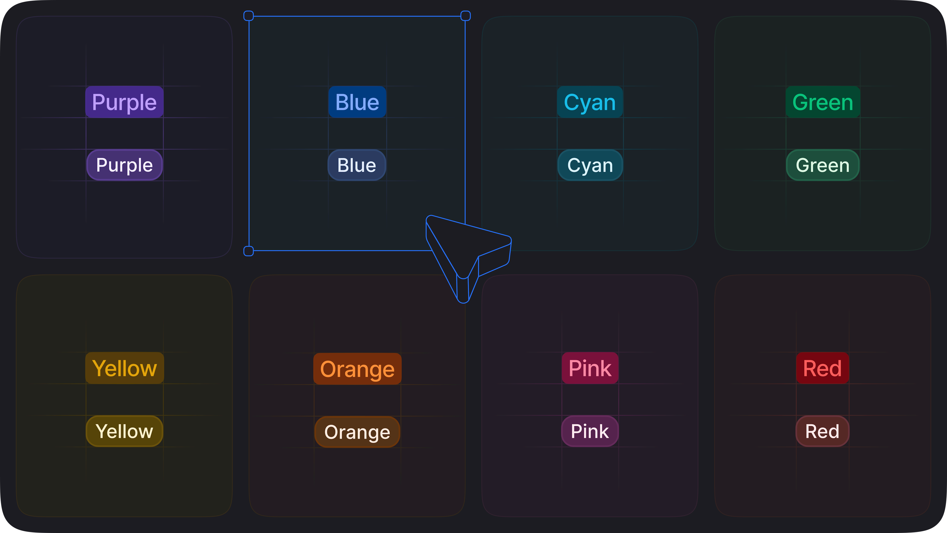
Enhanced color palettes 🎨
Our color palettes (in both light and dark mode) now look better than ever.
We adjusted our light palette and created a new dark palette to ensure proper brightness and saturation. We also created a bluer grey scale, which is now consistent with our accent color, as the previous one had a “brownish” tone.
Finally, we also have made sure chart colors are distinguishable for our users with color blindness 🙌